
Project 1: Splendor
Featured Project
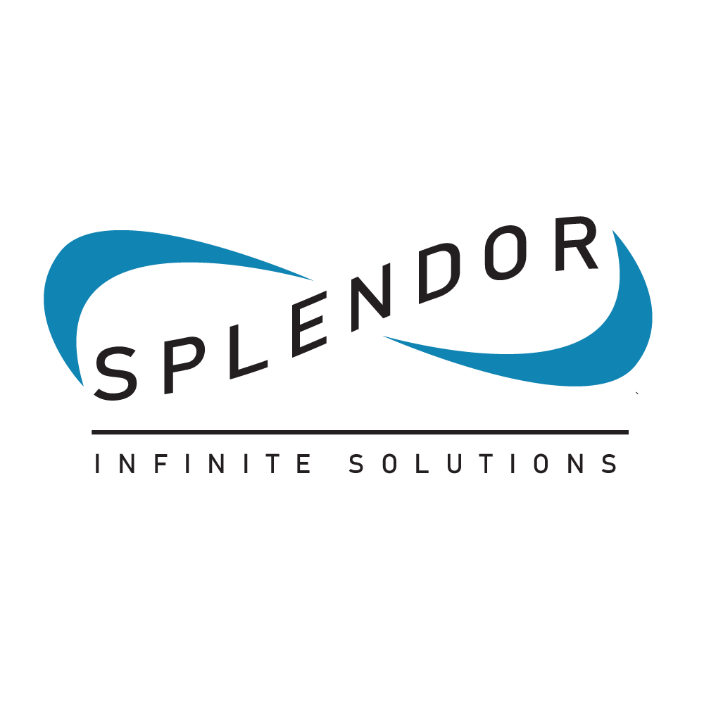
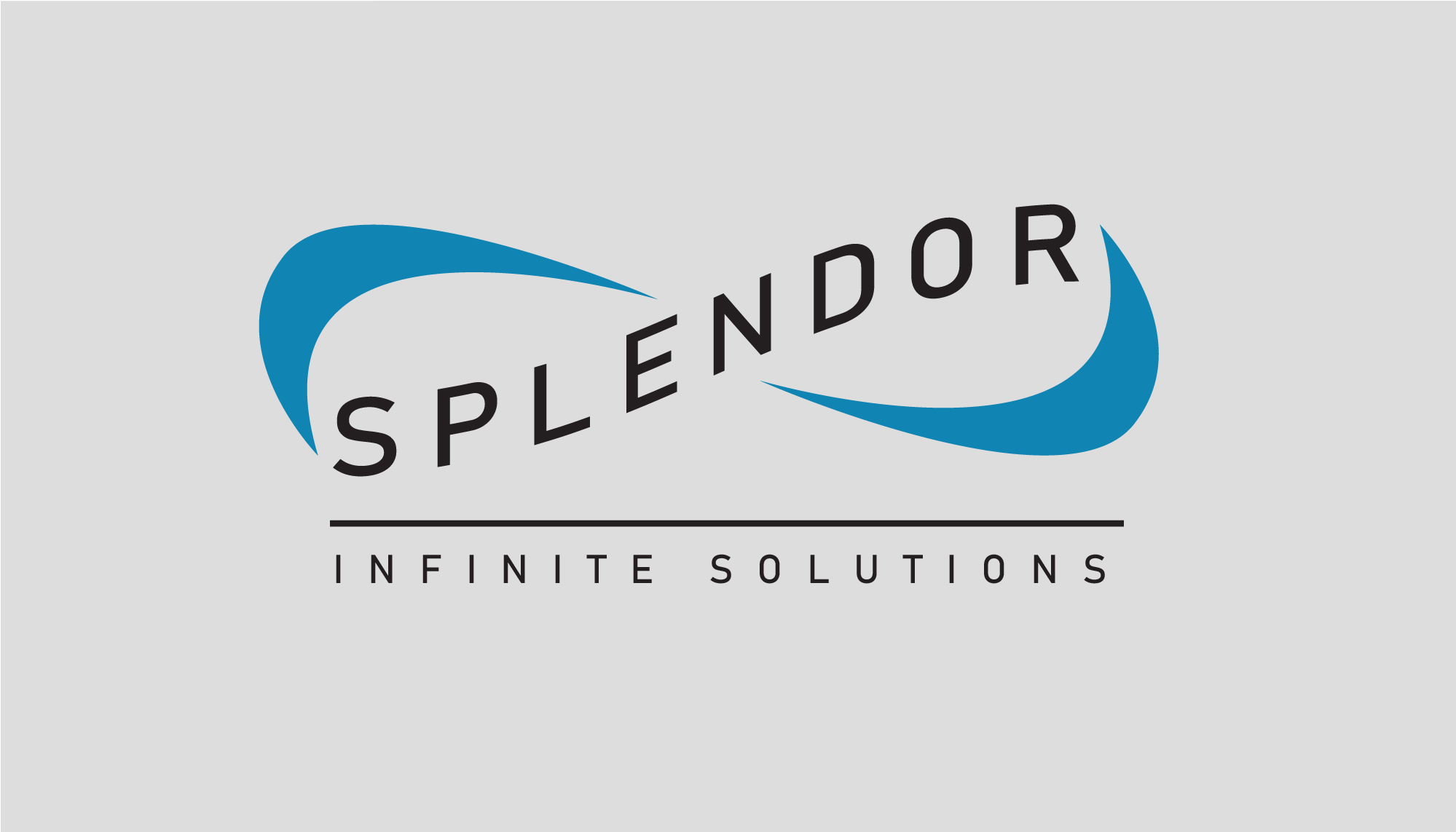
Splendor
Splendor is a medical technology company based on the idea of providing subscription based services that test and track specific illnesses. For this design I was given a lot of creative freedom in the brand, even getting to create the slogan, “Infinite Solutions”.
Splendor Branding Package
This company’s goal is to create new solutions for people giving them access to healthcare while still turning a profit and undercutting the competition through a subscription based platform and machine rental service. This idea became the basis for the Splendor logo design as well as the slogan. What I saw with Splendor was a progressive company that was willing to create new ways to solve old problems and to continue improving. This informed the “infinity motif” that I worked into the logo design. I wanted to portray to the customer that Splendor wasn’t set on simply working with the status quo and strived to continue to work hard to find solutions for them and their needs.

Colors
Blue and Grey
The colors of Splendor were also left completely up to me. I went very classic and conventional with my color choice, selecting two blue tones, common to the medical industry, that would help to portray calmness and trustworthiness that Splendor was trying to demonstrate. I also chose to use grey in Splendors assets rather than a warmer in order to portray the modern mindset of Splendor. I kept this grey very light however in order to provided a more stark contrast to the darker blue used by Splendor and again keep a more modern feel.
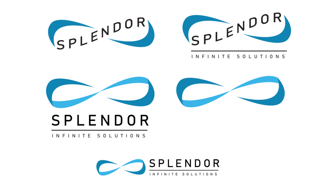
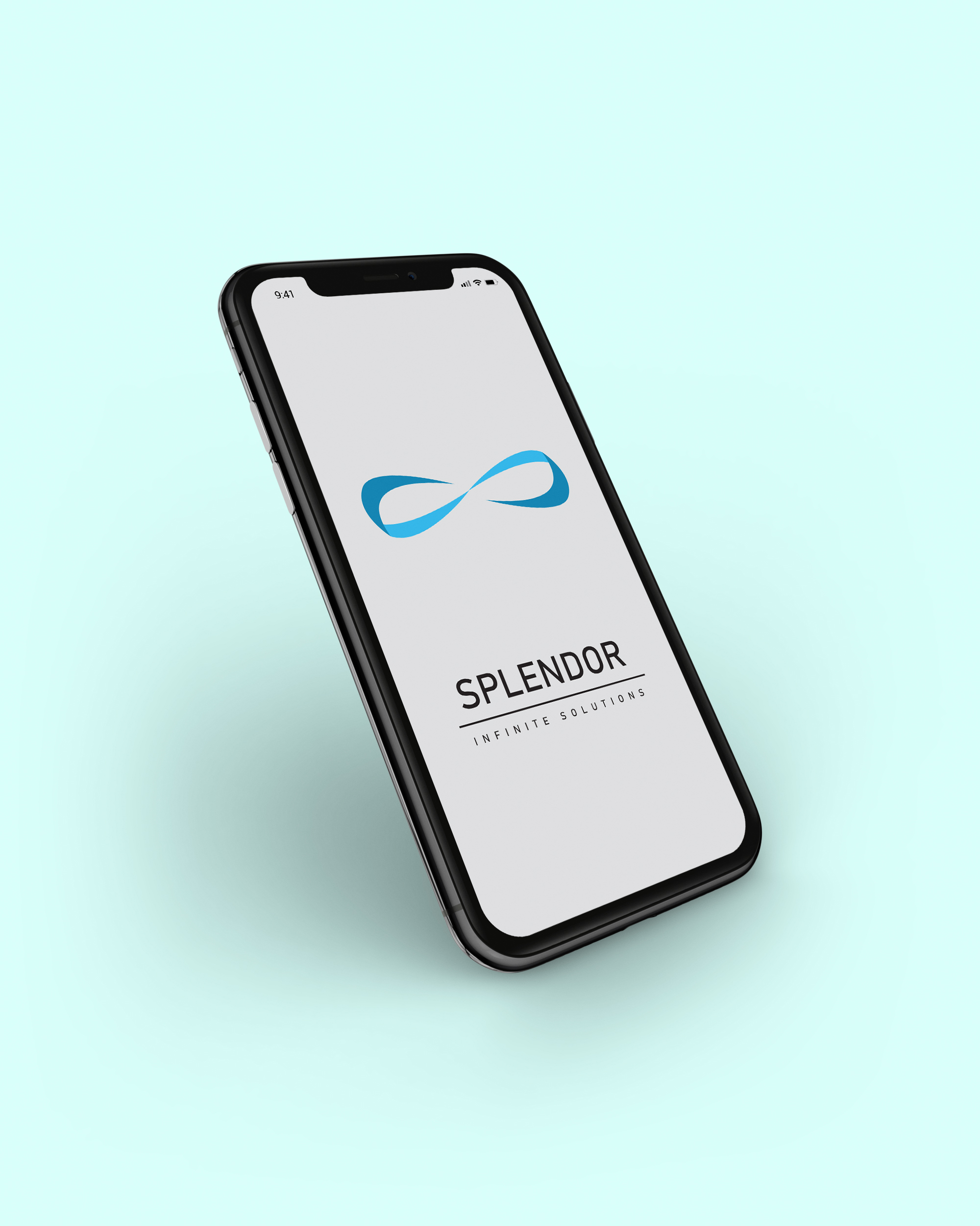
Adaptability
Typeless Logo
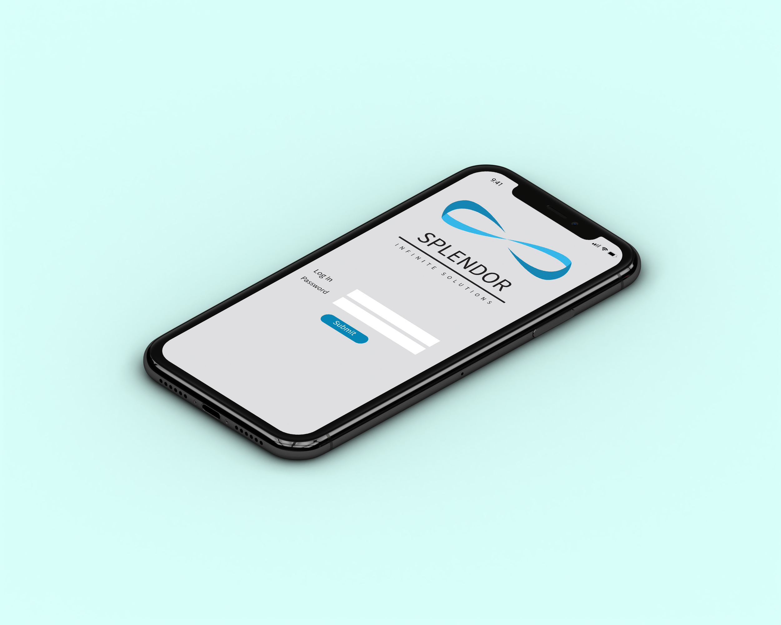
Being a modern subscription based company means that Splendors logo would need to be versatile in its ability to adapt to different sizes and use cases especially for use on screens such as smaller phone applications. I typeless logo was made expressly for this purpose, adding a secondary lighter blue color of the same hue but sticking with the same motif. The logo can now reused in many different ways, with type integrated, with an integrated tag line, with type adjacent or simply as a symbol with no type at all.
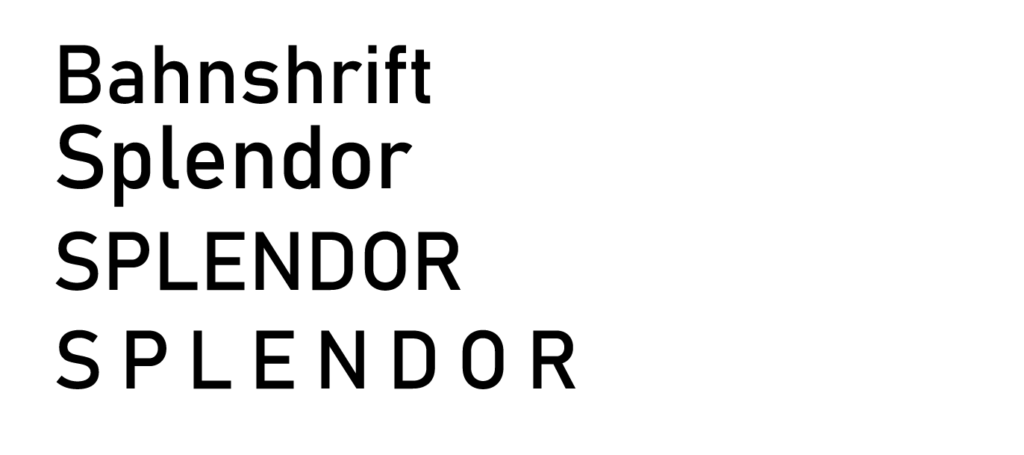
Font Choice
The Need for a Modern Feel
Font choice for Splendor was a relatively easy choice. While I did try out some chunkier more unique fonts ultimately a modern san-serif font with very little differentiation in line thickness made the most sense for the company and the warped shape of the text in the logo. I selected the Bahnschrift font for its simplicity and stability of the characters. I then adjusted the kerning (spacing between characters) and made the entirety of the name and tagline all capital letters to make the font even more wide and support and used this with the logo and tagline.
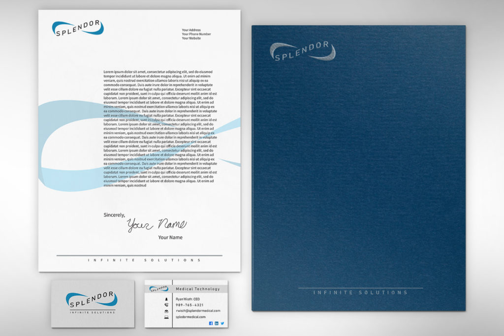
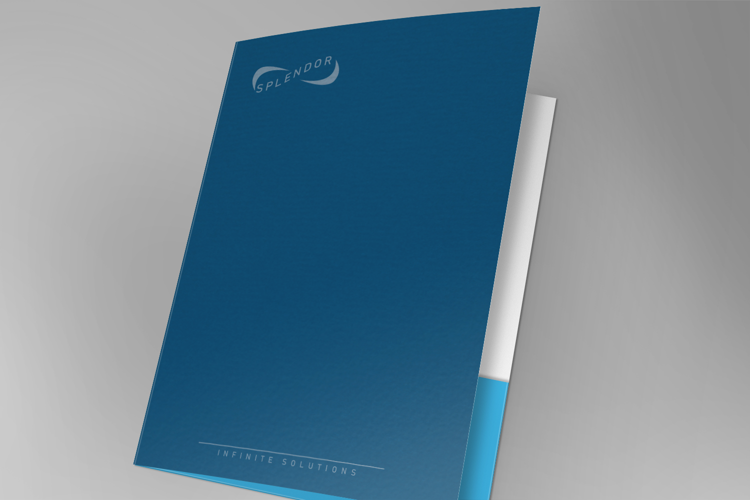
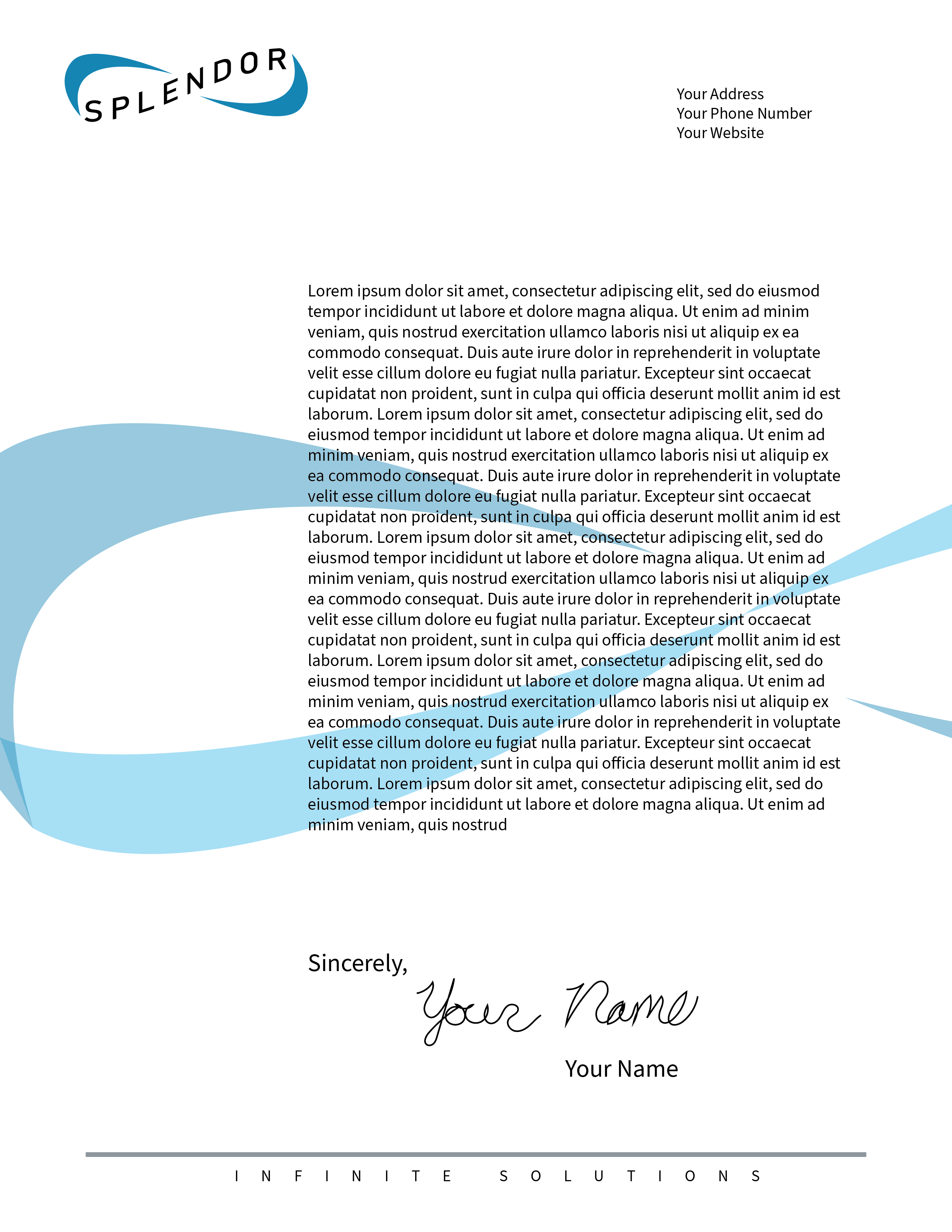
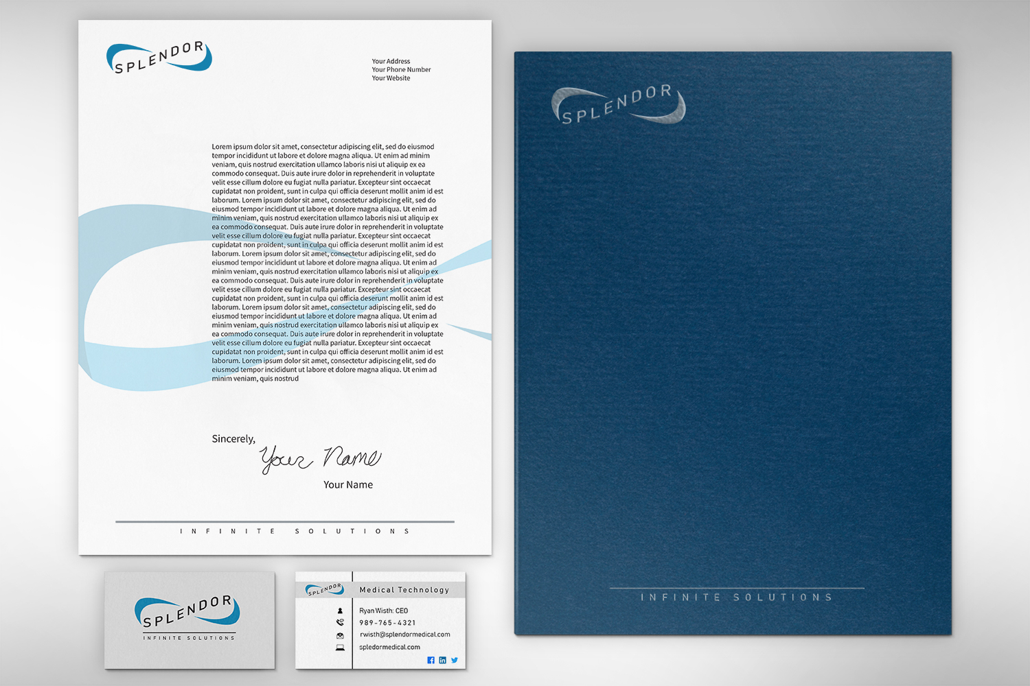
Branding Page
A Professional Set of Assets
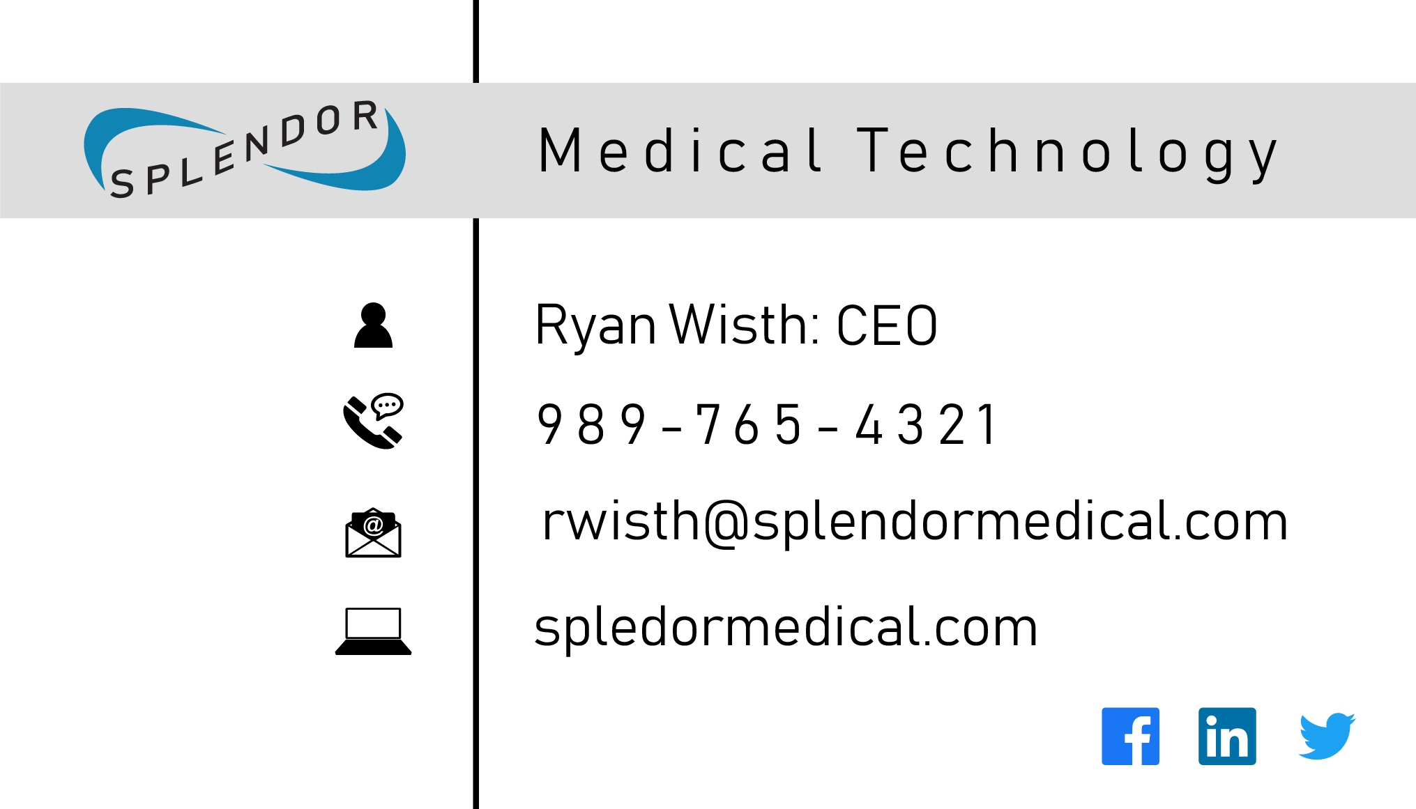
This company, being a new startup need professional assets in order to ensure that the brand and company portrayed itself in a unified way. I created multiple different assets for Splendor. Folder designs, stationary, and business card are a few of them. This also allowed the company to see how the type and logo can be used to represent their brand in other assets.
Splendor: Assets and Mock-ups
See More
Please take a look at my next portfolio project or check out the gallery for some more pictures of my work. If you would like to get in touch please contact me.