
Project 3: Quantum
Featured Project
Quantum
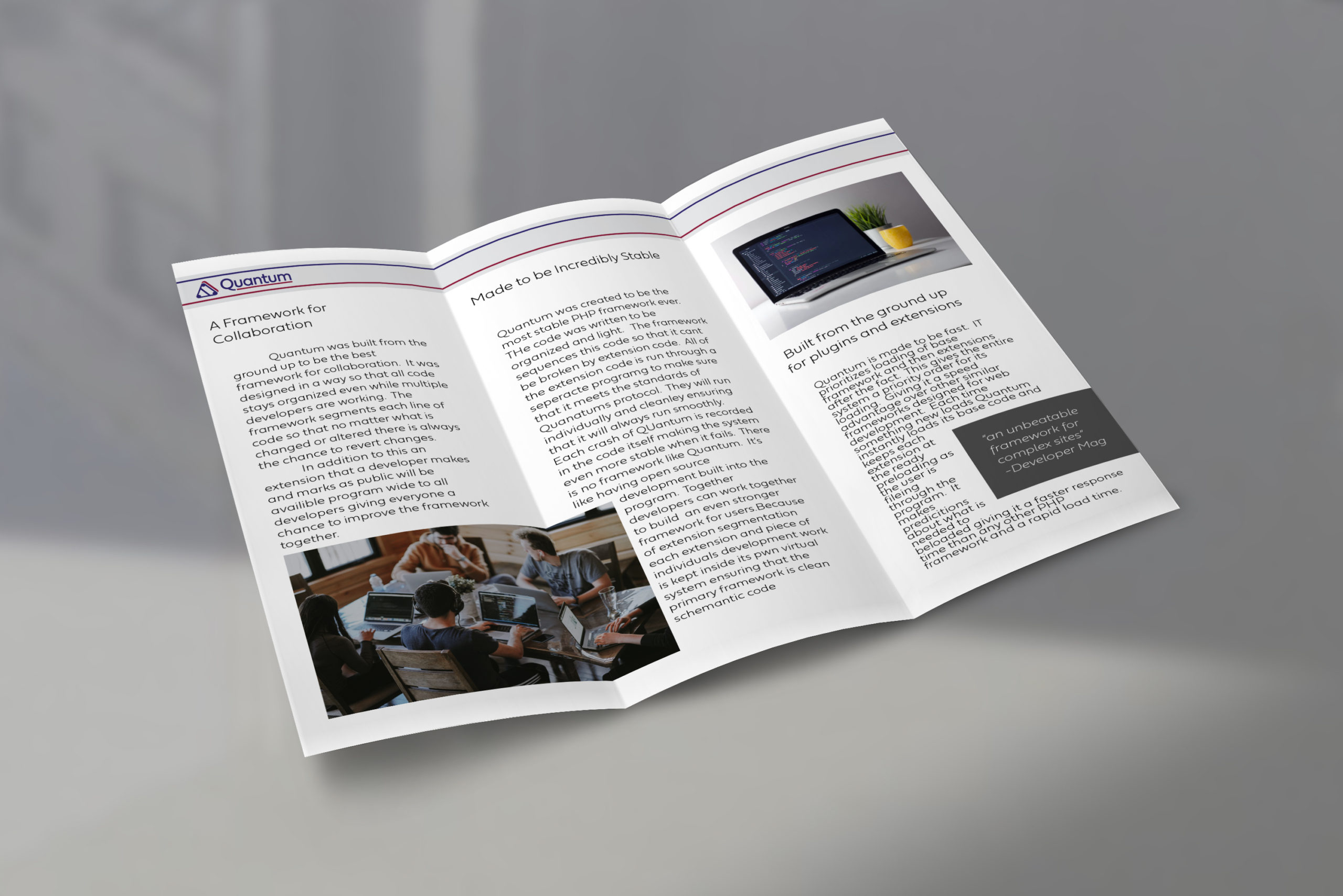
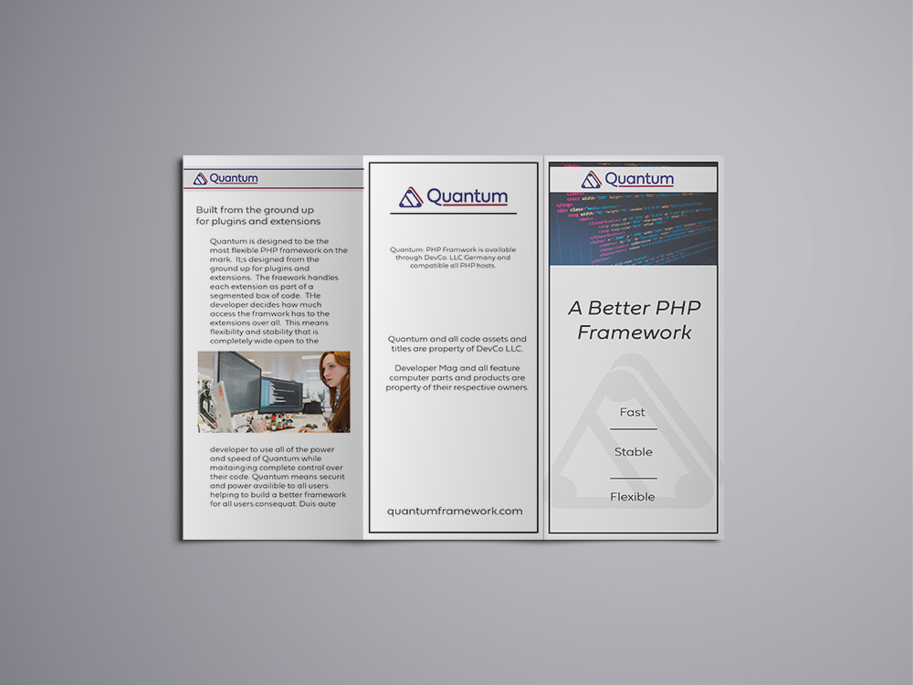
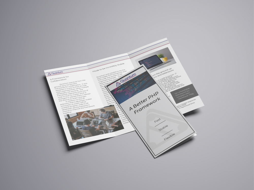
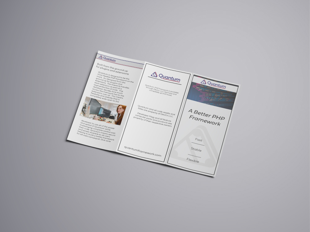
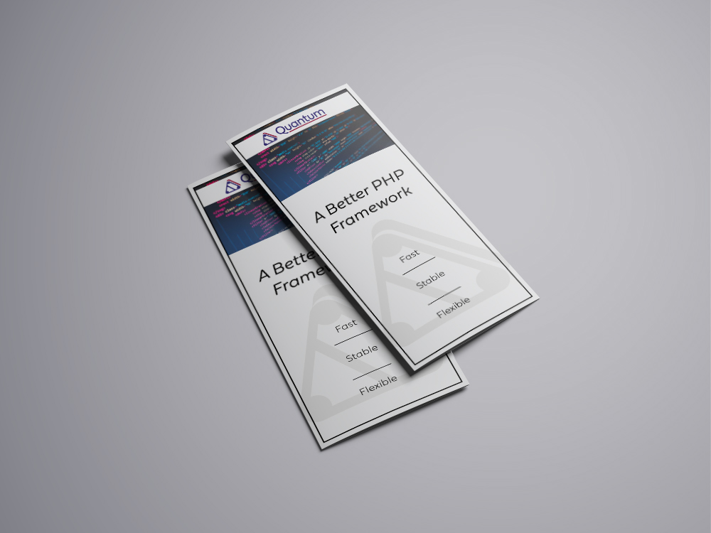
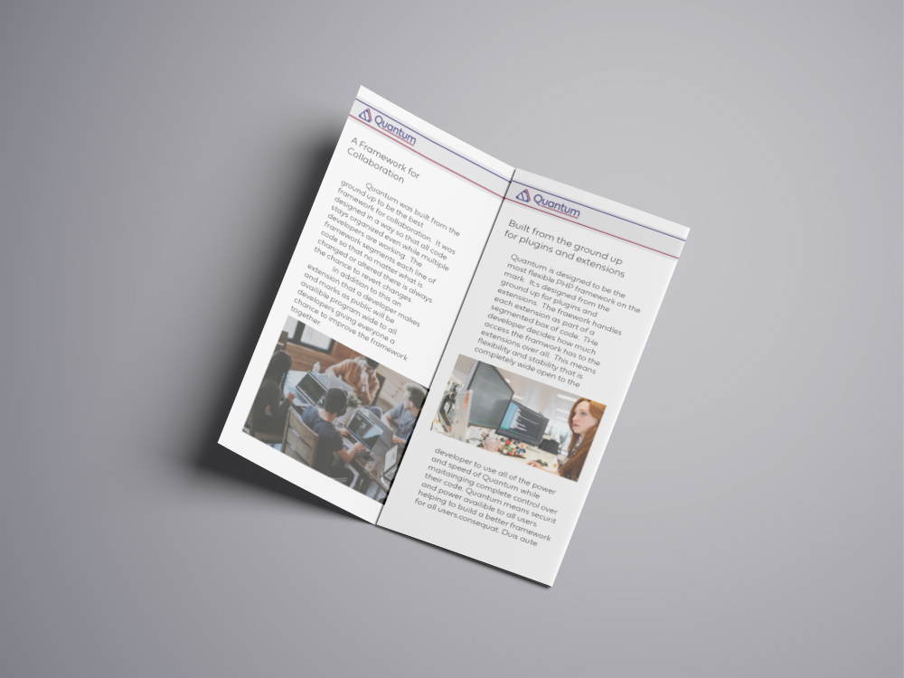
Quantum is a mock open-source framework for developers that use PHP to build applications online
This is a new framework PHP framework that is 10 times faster than other PHP frameworks allowing faster development and custom extensions that expand upon and grow the base that Quantum lays.
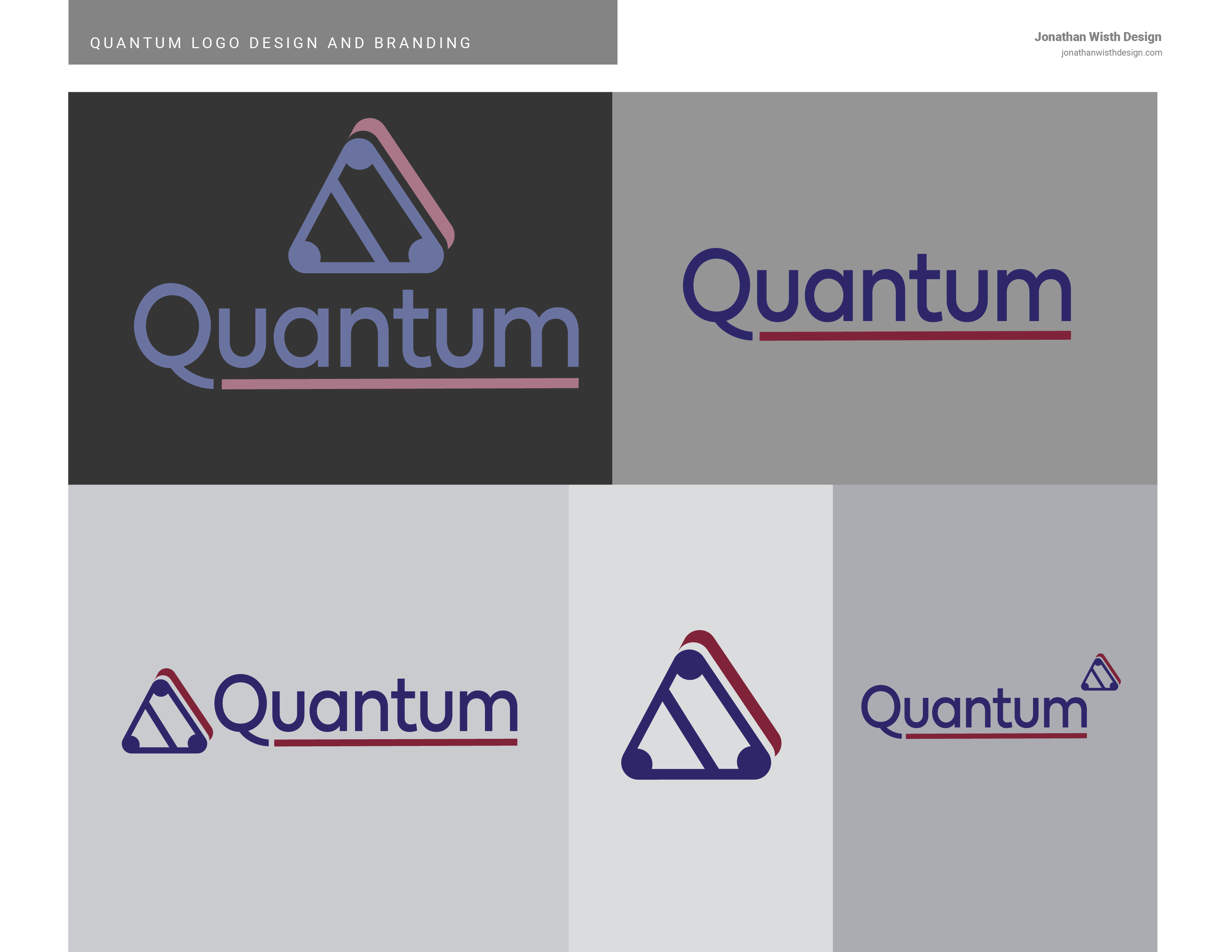
Quantum Logo, Brand Colors and Fonts
The companies request for quantum was to keep the minimal and reflect the stability of the Quantum’s code structure. They wanted the demographic of the logo to be developers. This means that the general public does not need to understand or interact with the logo meaning that it should be professional looking and only need to appeal to the senses of the developers utilizing the framework.
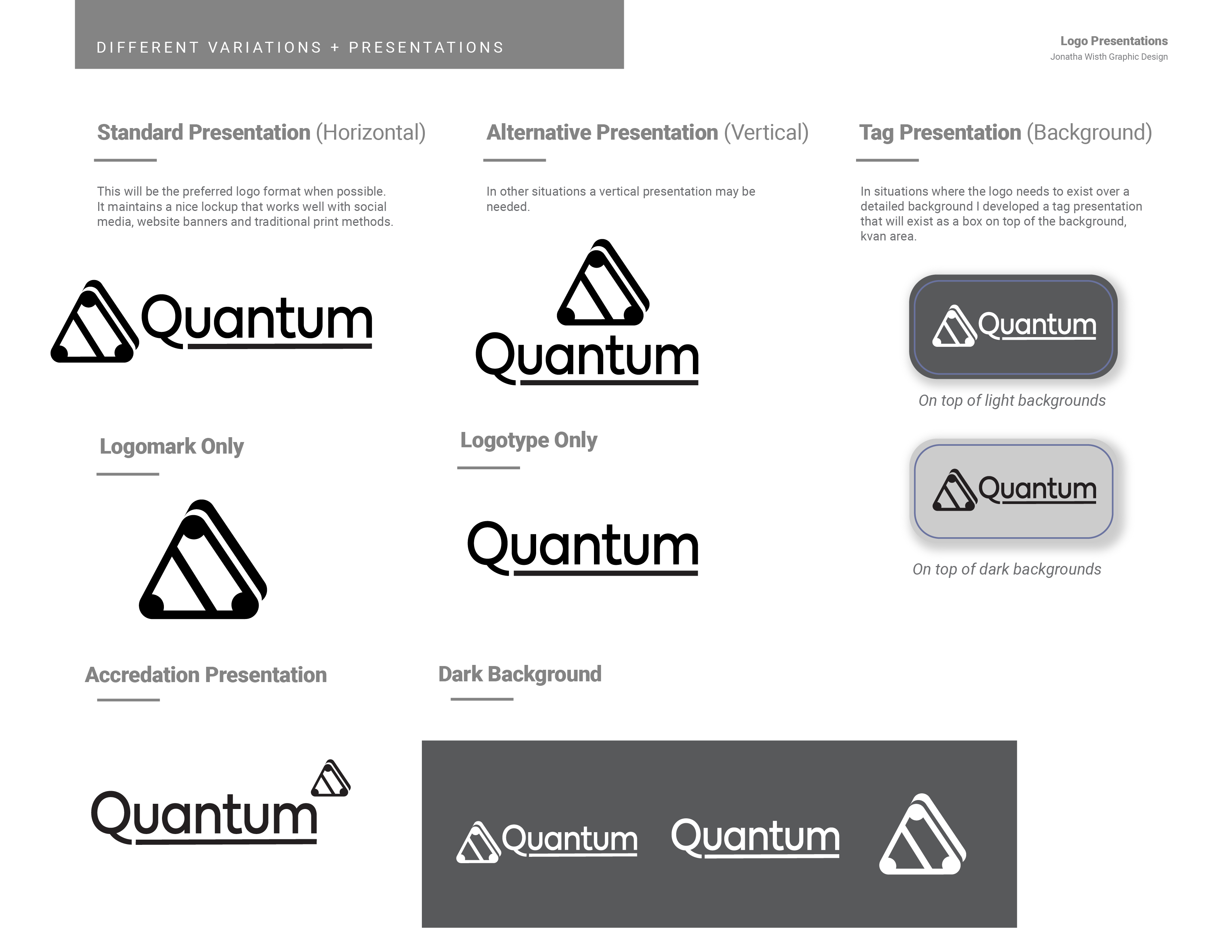
Logo Design
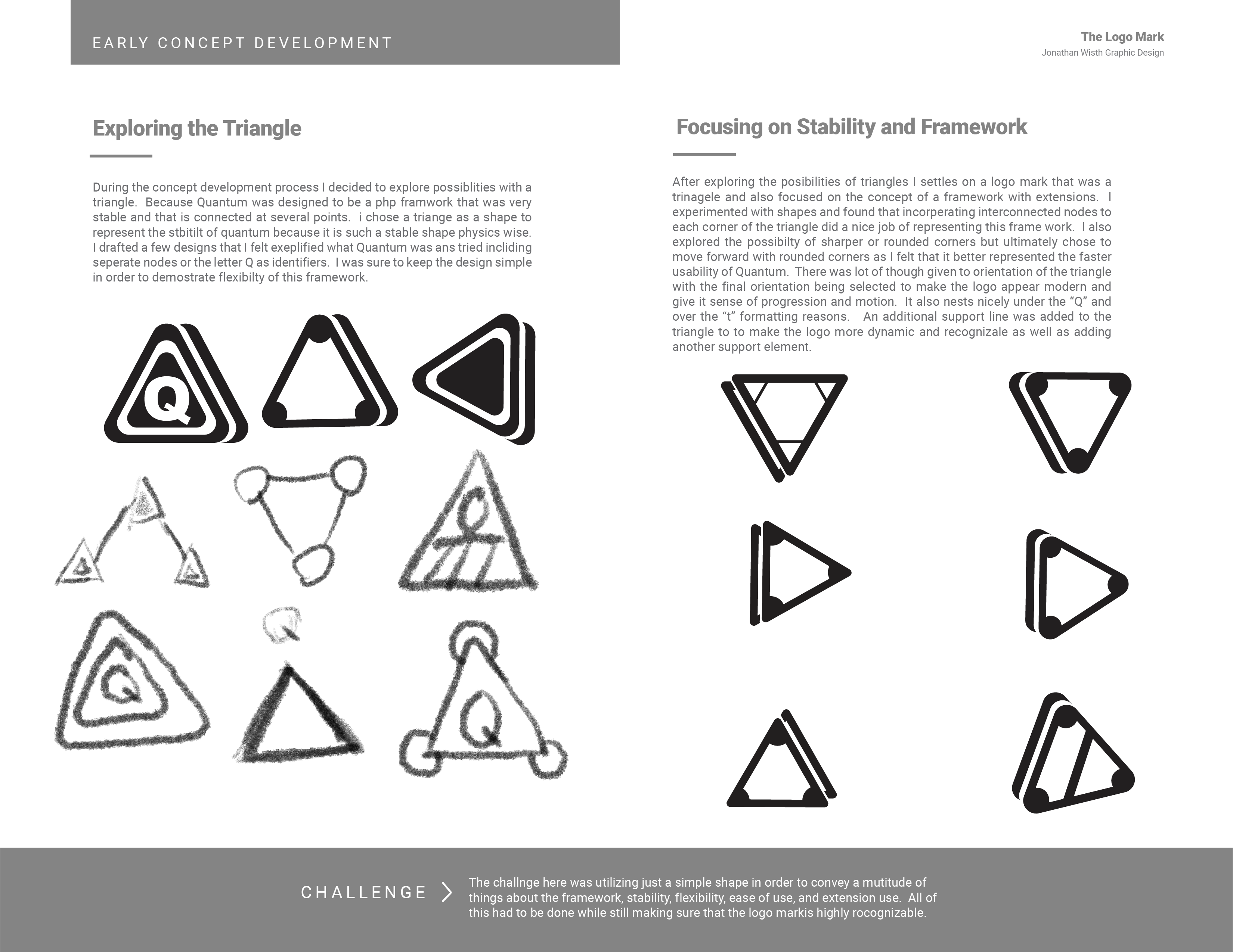
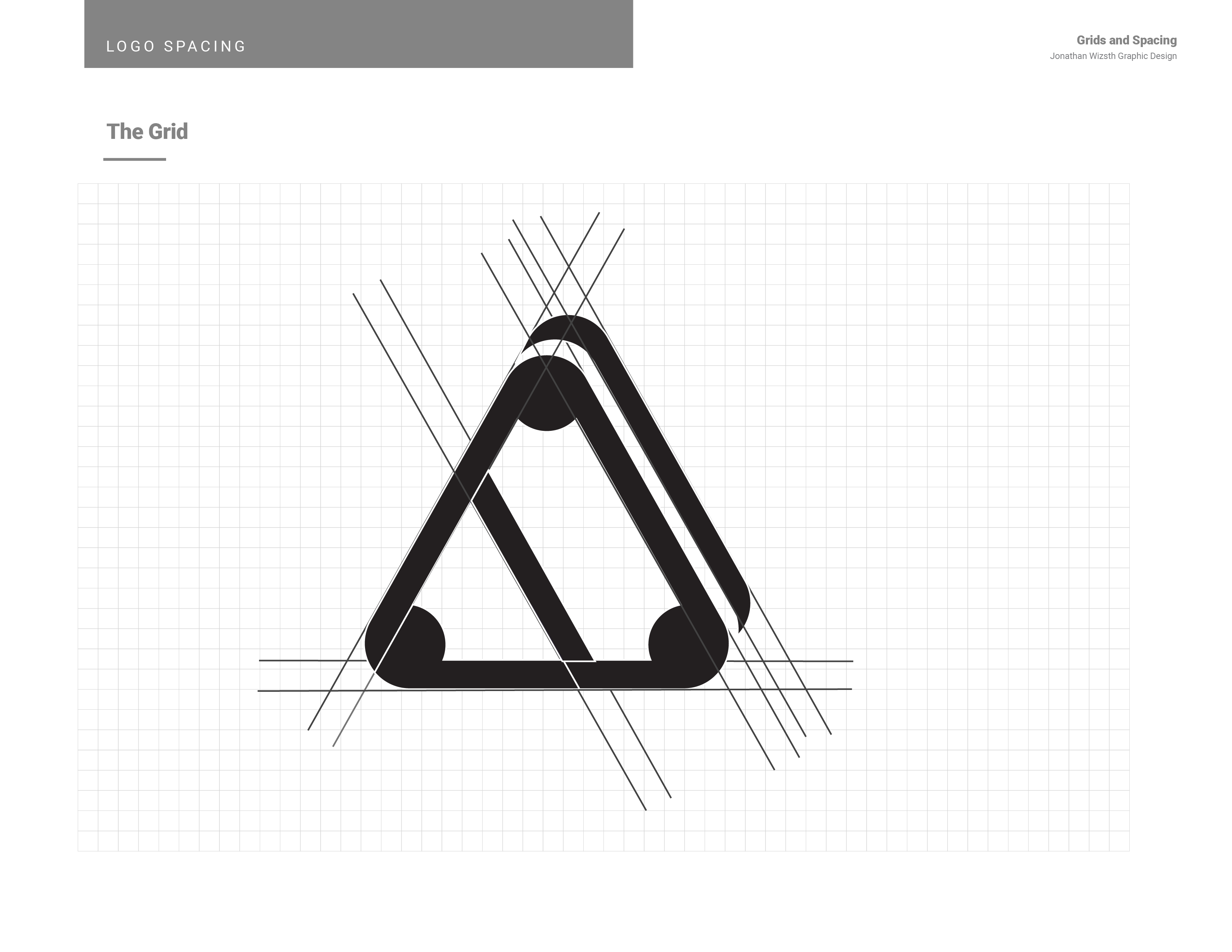
Triangles, Oh So Stable
With the clients request for a logo that demonstrates the stability my mind immediately jumps to triangles. Triangles, when it comes to building a physical structures, are very commonly used because the provide structure and stability just based on the fact that the distribute weight and pressure along multiple points. For this reason I selected a triangle as the primary shape for the Quantum logo.
I toyed with many different ideas involving triangles and how they work with other shapes or the letter “Q”. I eventually added circles to the corners of the triangle to represent the framework and extensions branching to each other. The additional layered line behind the triangle gives the logo a three dimensional look and make the triangle appear more substantial while still retaining modern flat logo design.
Modern and Professional
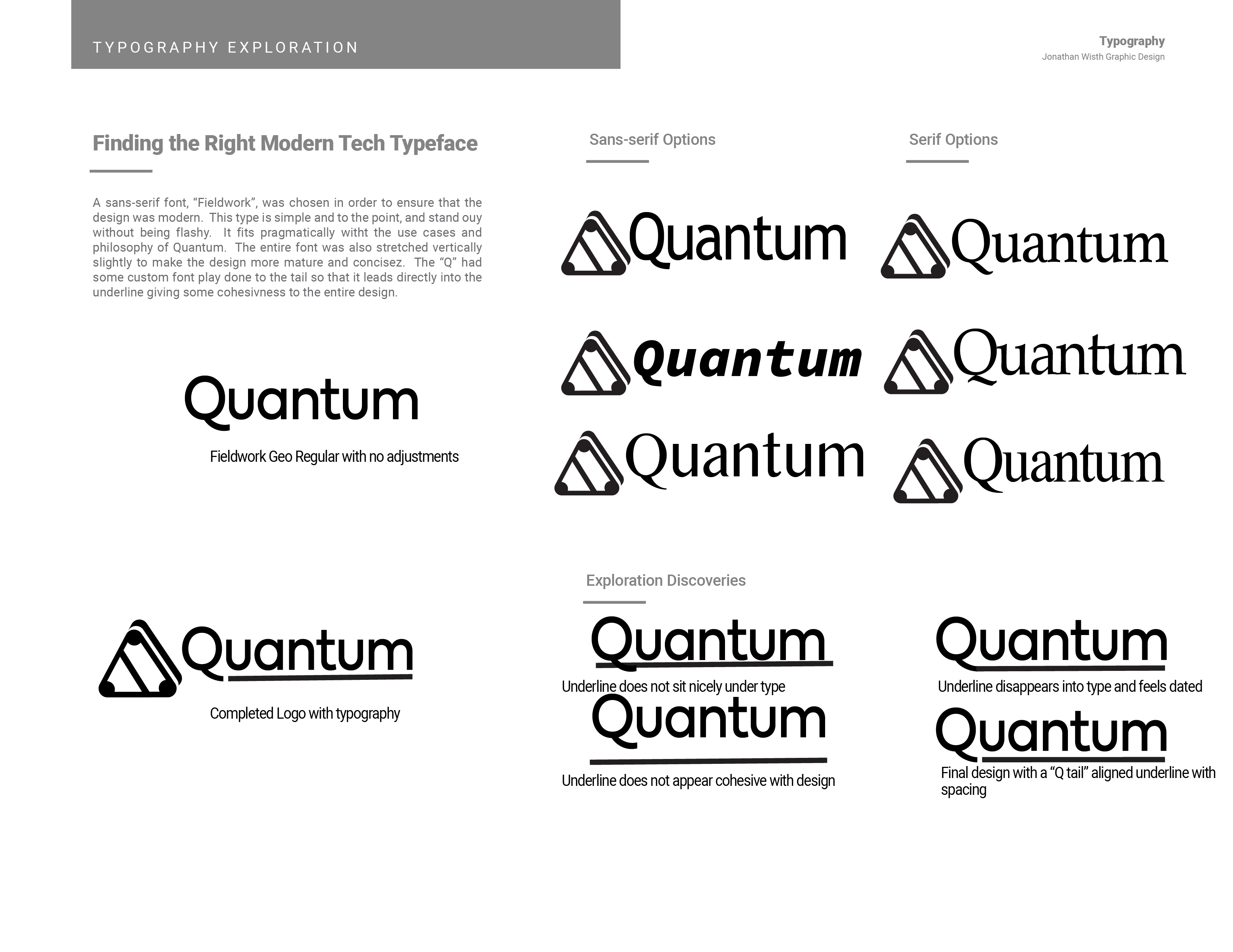
A Minimal San Serif
My font selections were originally based on a classic industrial look. You can see some of this in the earlier color exploration for Quantum. The font was a bit more slanted and aggressive and I stuck with this font for a while during the design process before eventually switching to Fieldwork for the final design. Fieldwork is a sleek simple and modern sans-serif font. It cans still appear industrial but is less dated, something important for a technology logo representing a framework that is new and advanced. The font appeals to the sensibilities that a web developer might have, clear, concise, and organized. I then adjusted the kerning (letter spacing) on the name and squeezed the text horizontally just a bit to make the word look less like plain text and give the logo a naturally cohesive look.
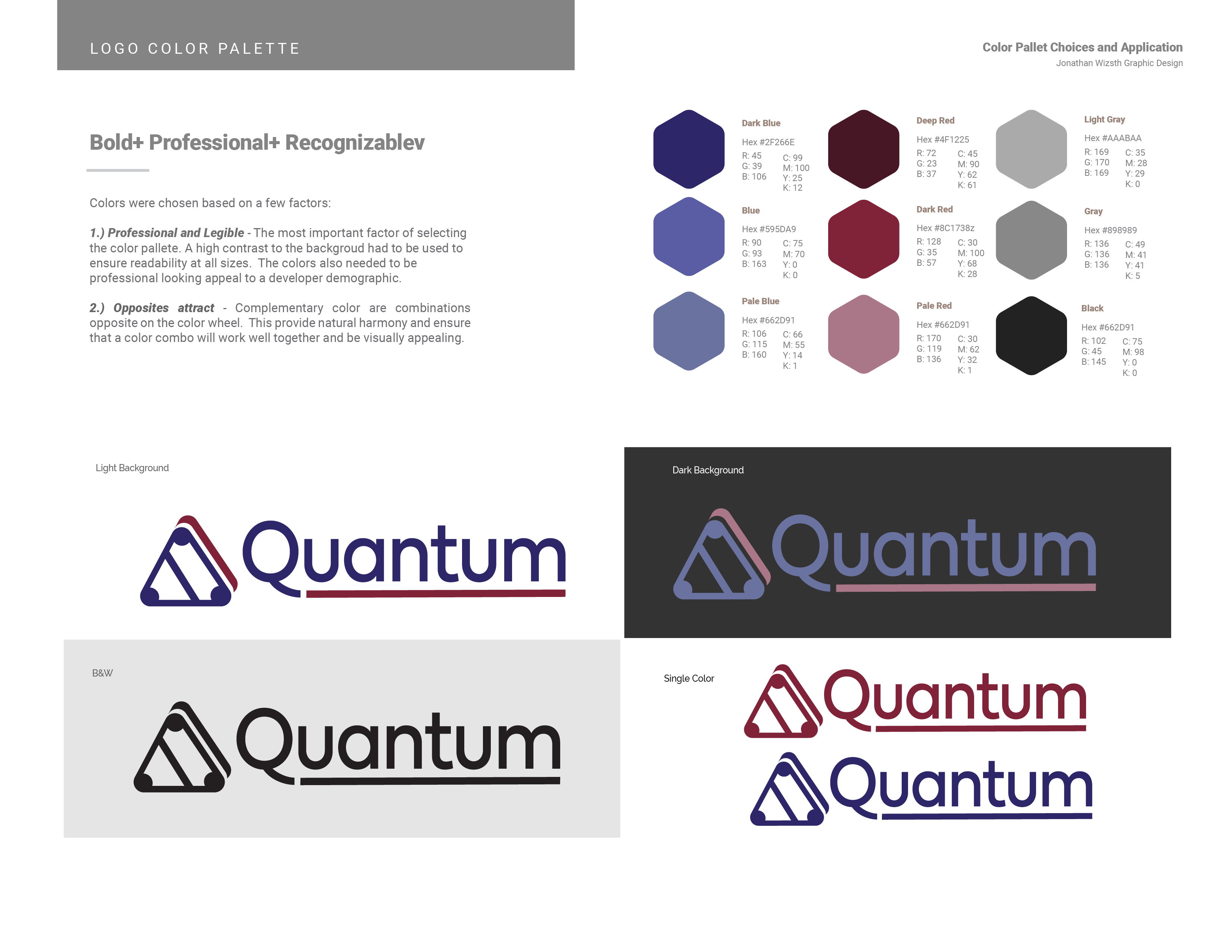
The Colors
High Contrast. High Professionalism
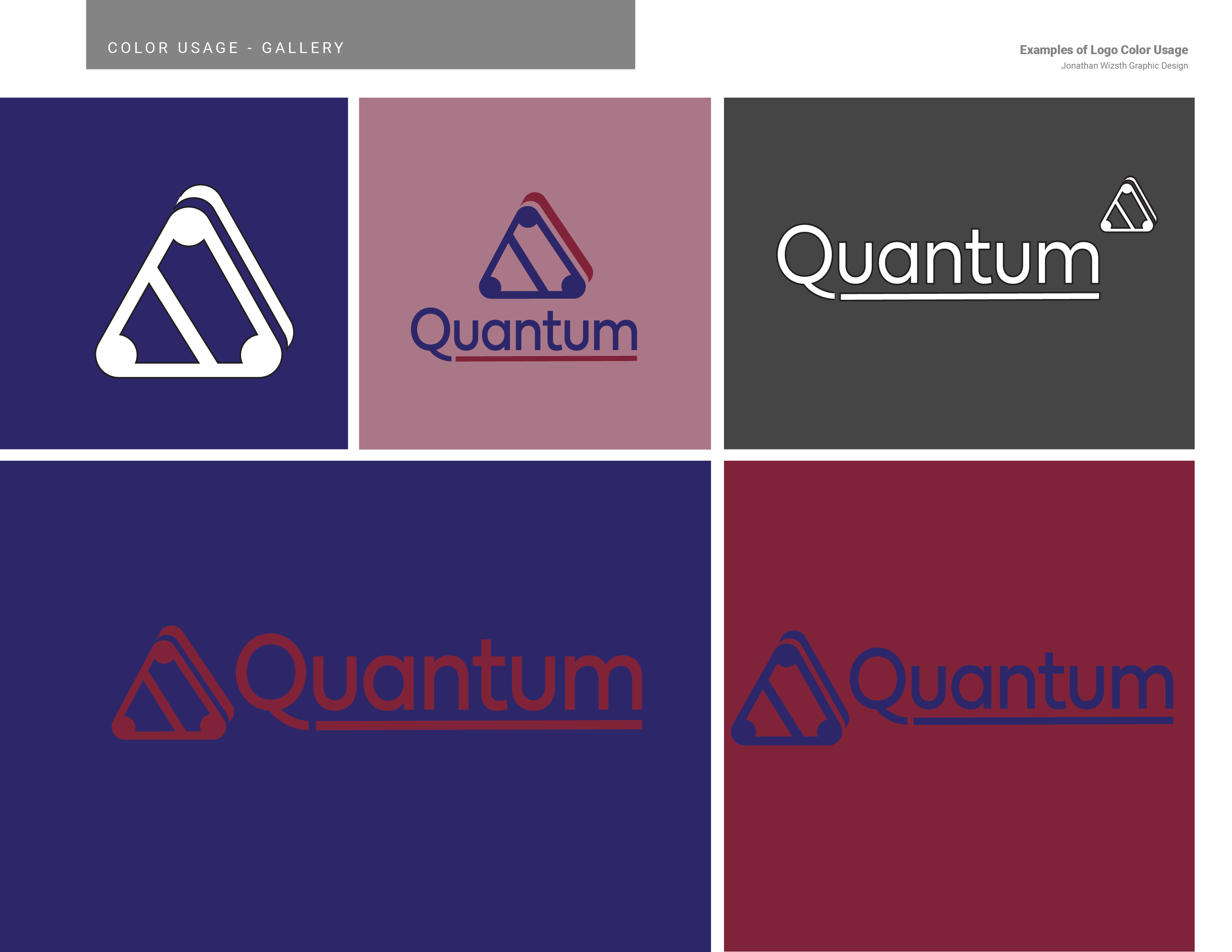
I chose a color pallet for Quantum that is rooted in dark shades of blue and red. I selected blue due to its nature of reliability. I wanted Quantum to feel like an incredibly safe and reliable choice for PHP developers. Red was selected to counter blue as it is its most complementary color. In order to ensure that such sharp contrast did not make the logo too vivid or childish and ensure a professional look I kept the pallet dark with higher levels of black for the two primary logo colors. I then selected gray tones to round out the pallet and ensure that there was a neutral color to mute the high contrast of red and blue when necessary and make the the branding modern and professional oriented.
The Details
Underlines and Tilts
The line underneath Quantum took some time to situate nicely. I tried it in different planets along the base line of the letter but decided in the end to have it extend from the letter “Q”. I kept the line its own entity informing my decision to make it its own color and situations it nicely under the type. This also ensure that the design still looked modern but also cohesive.
I spent a long time playing with the angle of the Quantum logo. I really like the look of the logo on a slant or balanced on one point but ultimately I decided on having the logo be flat on one side with the red overlapped shape on the right side of the logo. This was a purely functional choice, in the end. It made the triangle appear the most stable and kept the sense of directional flow to the right to mach the underline of Quantum.
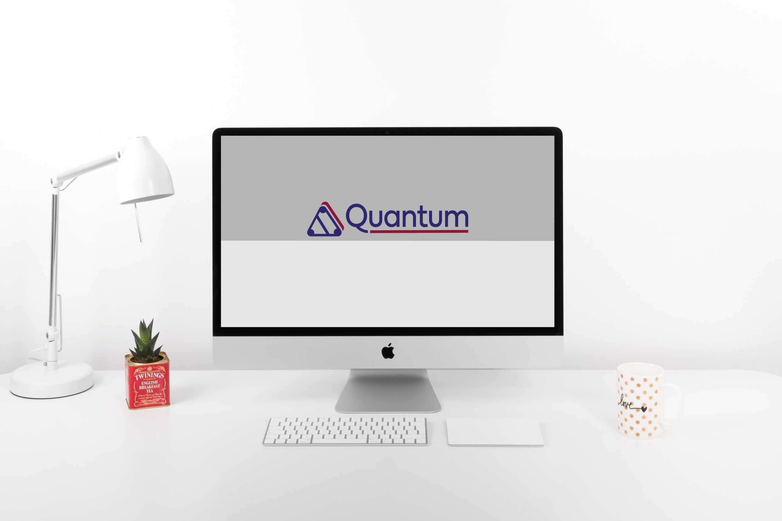
Quantum: Client Presentation and Brochure Mock-up Gallery
See more
Take a look at my next portfolio project or check out the gallery for some more pictures of my work on this project. If you would like to get in touch please contact me.