Project 2: Oakao
Featured Project
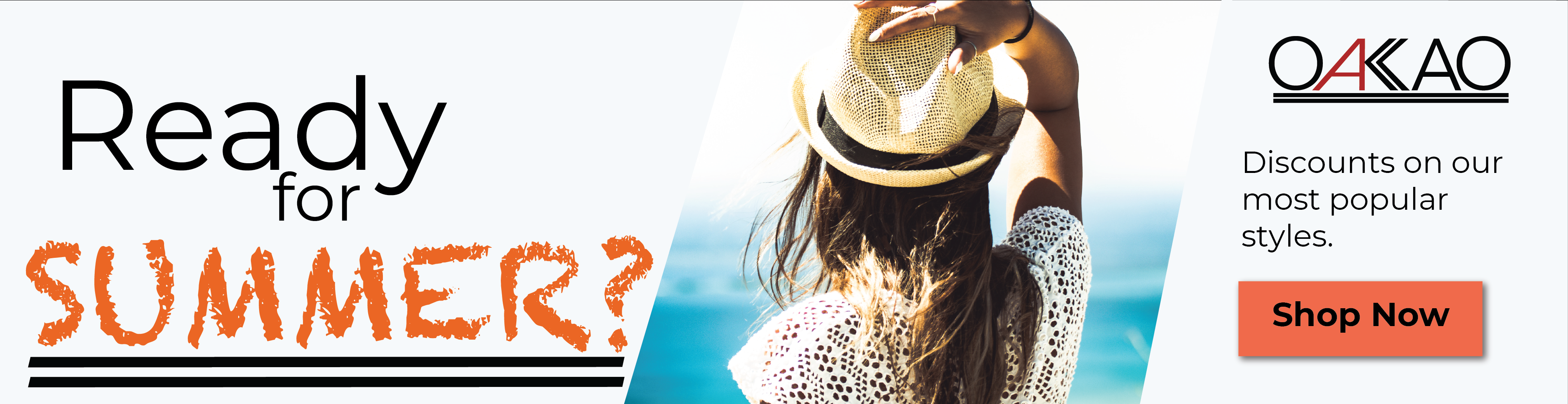
Oakao
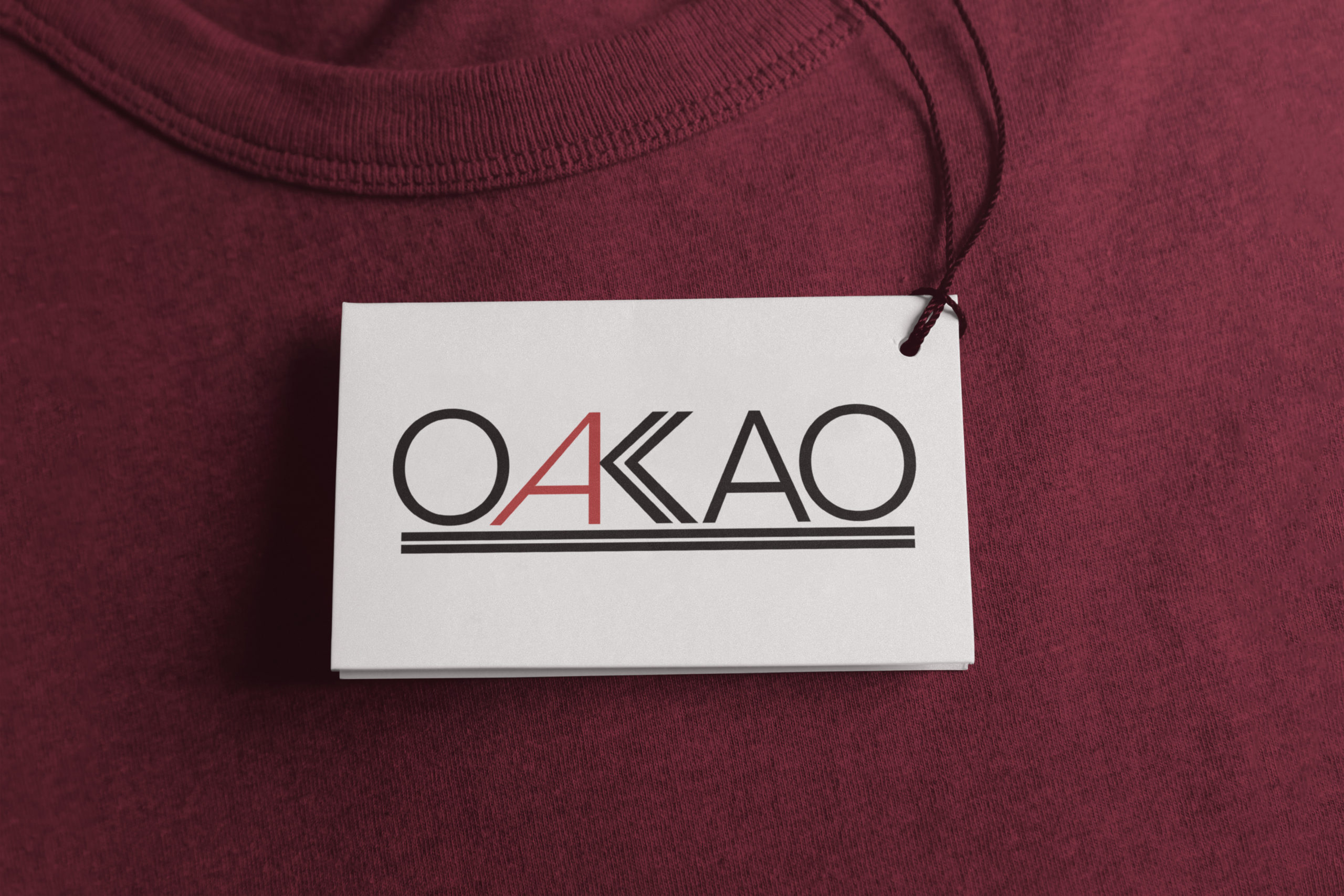
Oakao is a mock-fashion brand that I designed a logo for as well as brand identity and page layouts for a fashion magazines and branding tags. This logo was designed to portray Oakao’s vision of high fashion but high function clothing.
Oakao Logo, Identity, and Layouts
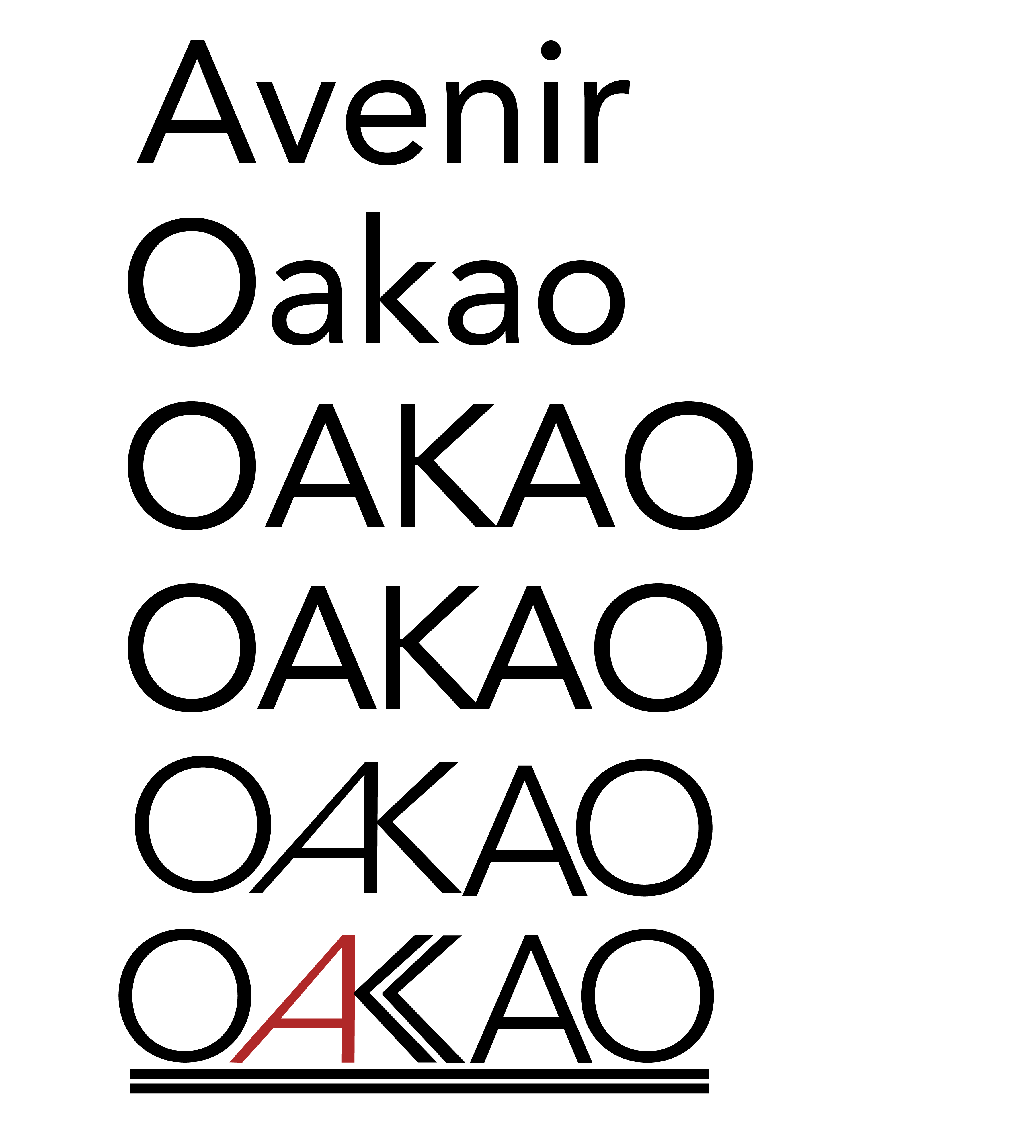
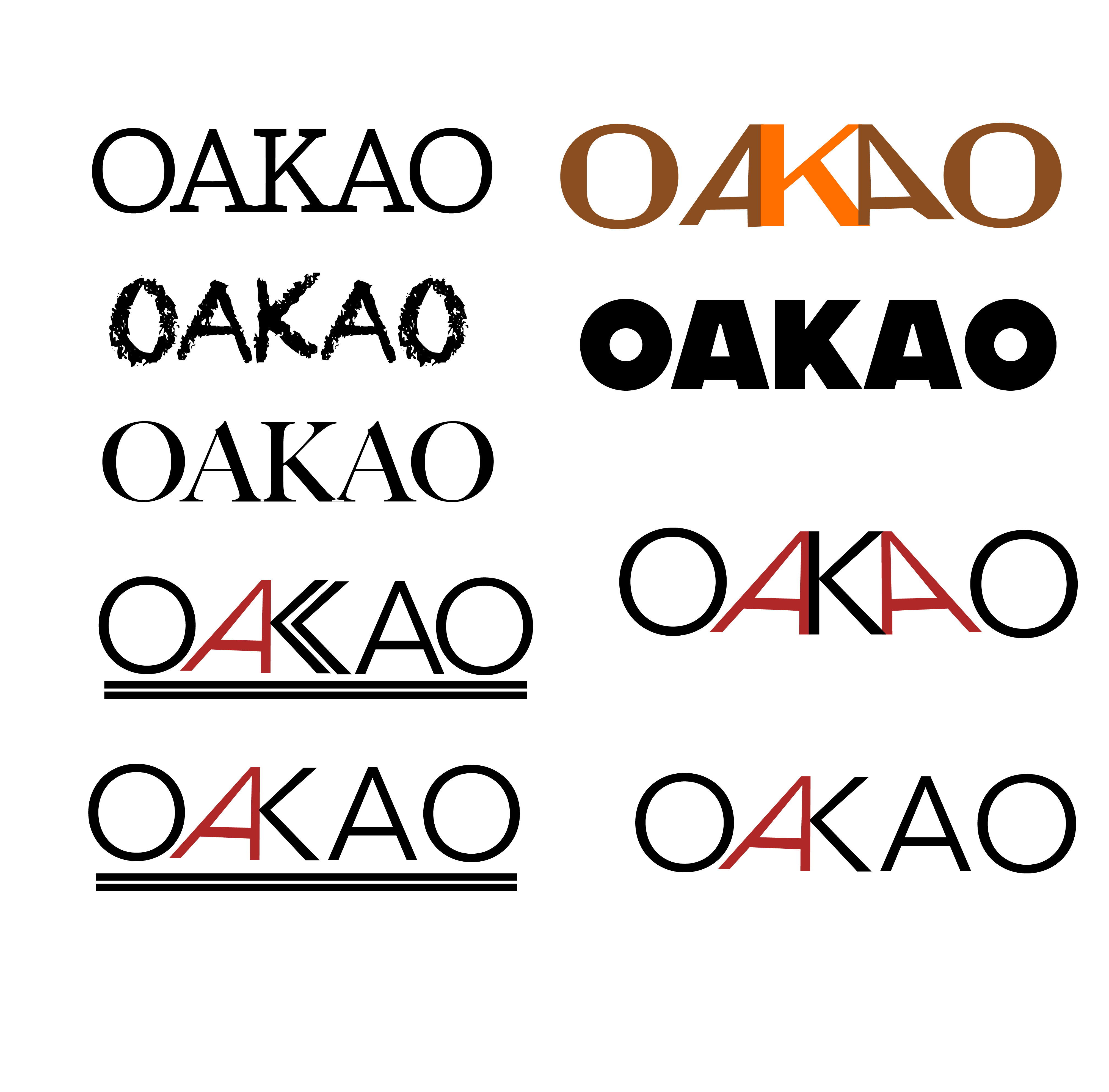
Oakao is a fashion brand that prides itself on fashionable clothing that is also incredibly functional. it’s branding has a focus on the outdoors. Their clothing is designed to be durable but also have a strong sense of style. My task was to create a word mark (a mark that is only modified text with no logo mark), common for clothing brands. I designed the Oakao word mark to exemplify the the sense of style that the brand is trying to portray.

Colors
Saturated Warm Tones
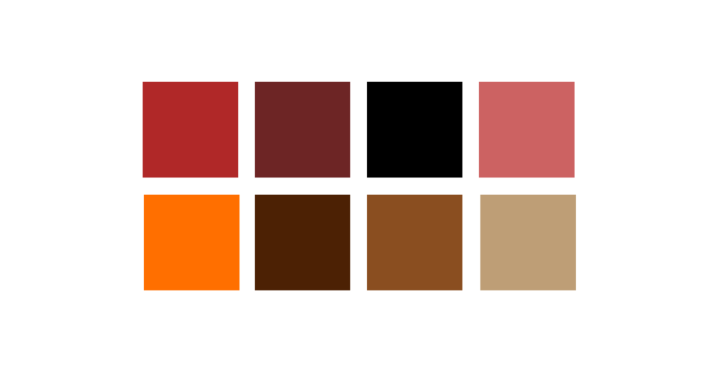
Selecting the colors for Oakao’s word mark was a matter of selecting colors that felt like the outdoors. I needed colors that portrayed the sense of ruggedness but also the modern fashion styles of the brand. I ended I explored multiple warm tones white creating the word mark but ultimately settled on a deep red and used that to accent a solid black. The strong sense of contrast helps the brand feel modern and bold. I did test out other warm colors for the logo that ended up being the other brand colors that I utilized. This collection of colors gives a feeling of autumn helping to tie together the sense of a bold and resilient fabrics and modern outdoorsy styles. The main word mark colors specifically match a classic red and black plaid flannel which perfectly portrays the style of the brand.
Branding
Two Perfect Lines Build the Brand
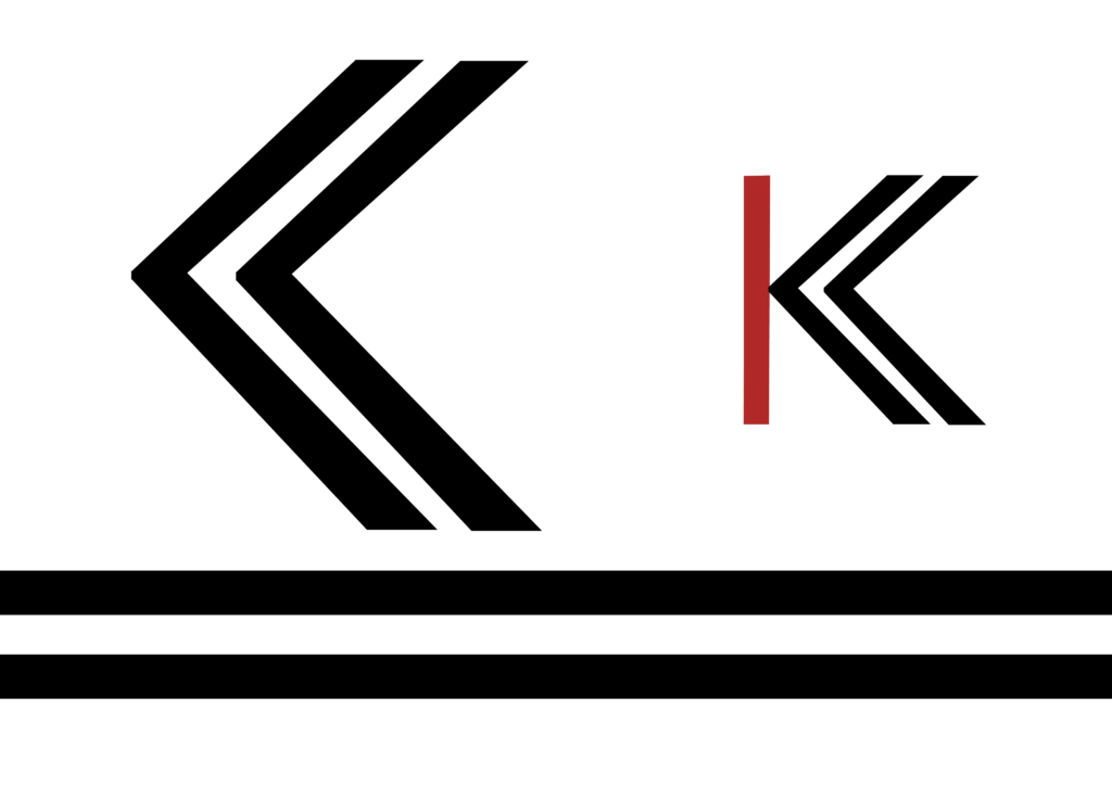
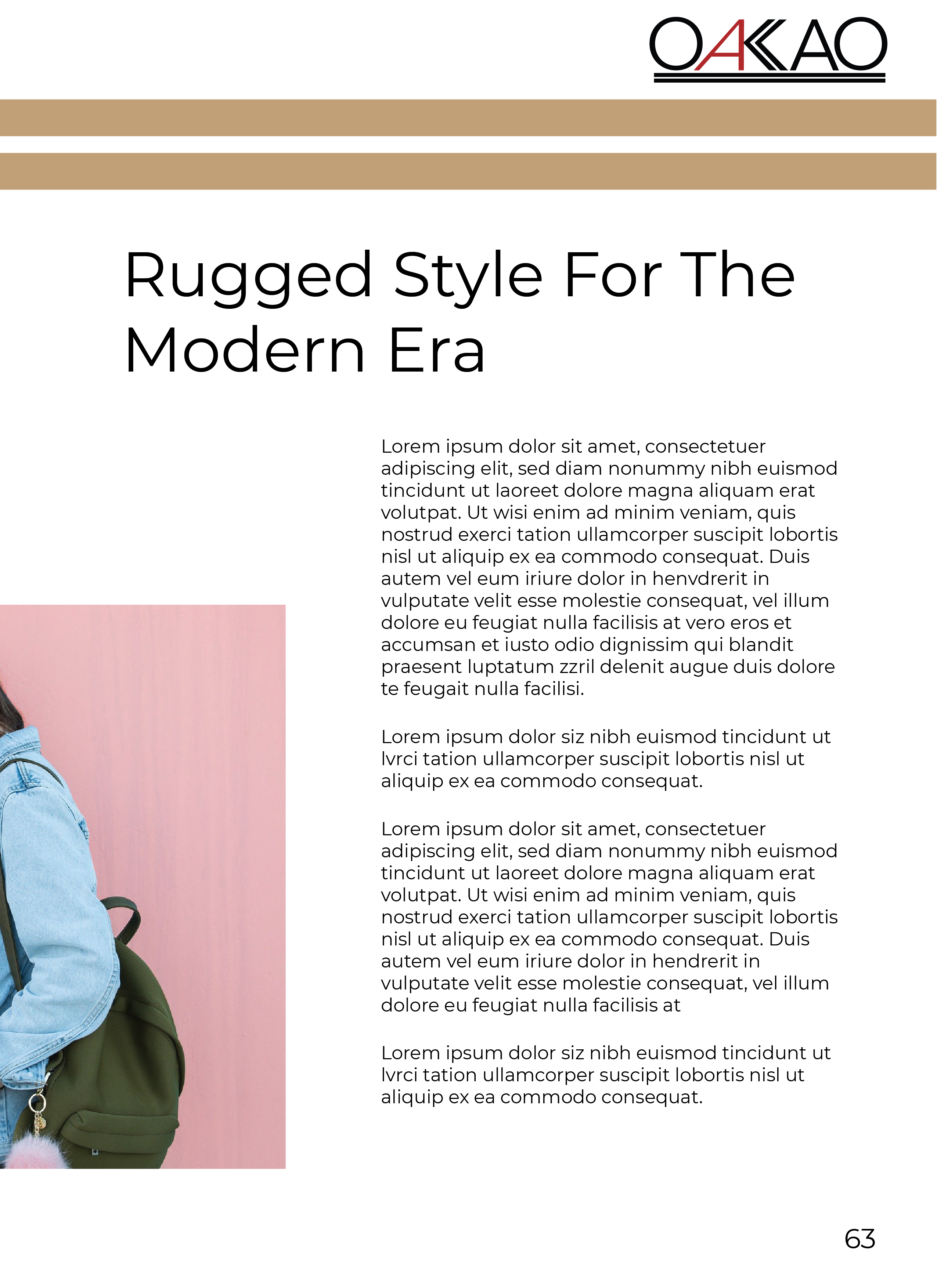
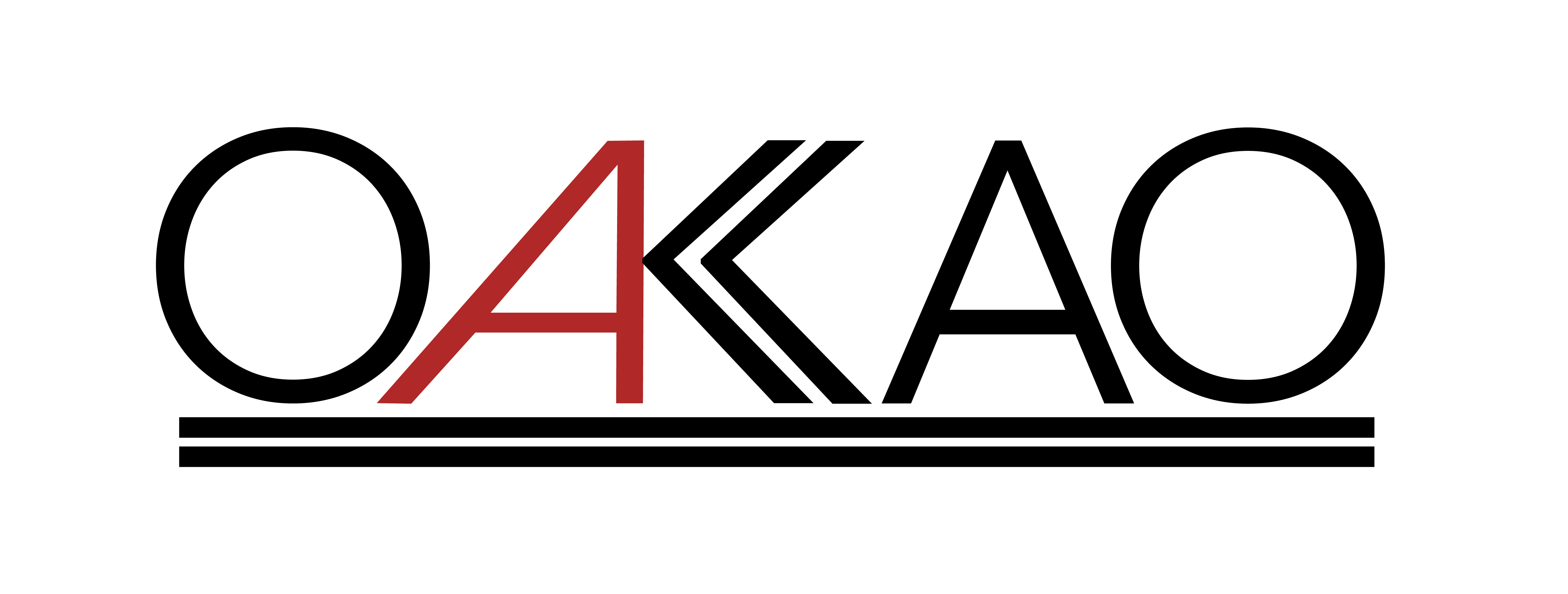
In addition to adding two underlines to the text I also altered the “K” to link up with the “A” and be two double bent lines. This ties the text and underline together and also gave me an additional chance to give a branding aspect to a logo that is only a modified font. These double line setup also acts as a branding asset. You can chee one of its uses in my magazine article layout. This helps to give the brand an identity and solidify recognition of the brand. The two lines also make the brand appear bold with the lines forming the crook of the “K” evoking a sense of direction and motion. Looking like an arrow helps to reinforce the wilderness feeling of the brand as well giving the double lines multiple functions. v

Font Choice
Rugged but Modern
Font choice for Oakao was challenging. The sense of ruggedness would make me want to pick a thicker chunkier font that feels sturdy. However, the modern style would push me toward a thinner more delicate font. These were were two conflicting ideas. I attempted using thicker fonts and more classic serif fonts but they all fell by the wayside as I finalized what to font to use because they all failed to portray the brands modern style. Instead I selected a font with finer lines, Avenir, and added a double underline and adjusted the kerning(spacing between letters) to give the word the strength and stability of a thick font but still keep the more delicate lines of the font. I then bent the “A” to the side to give a sense of motion and evoke the sense of progress and adventure in the word mark.

Utilizing the Brand
Magazine Layout
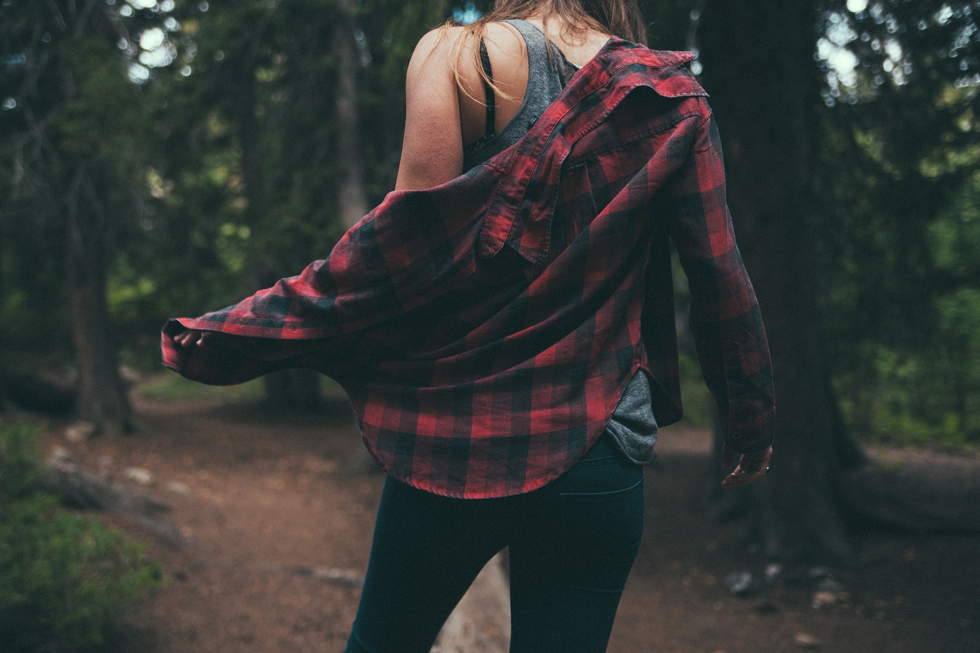
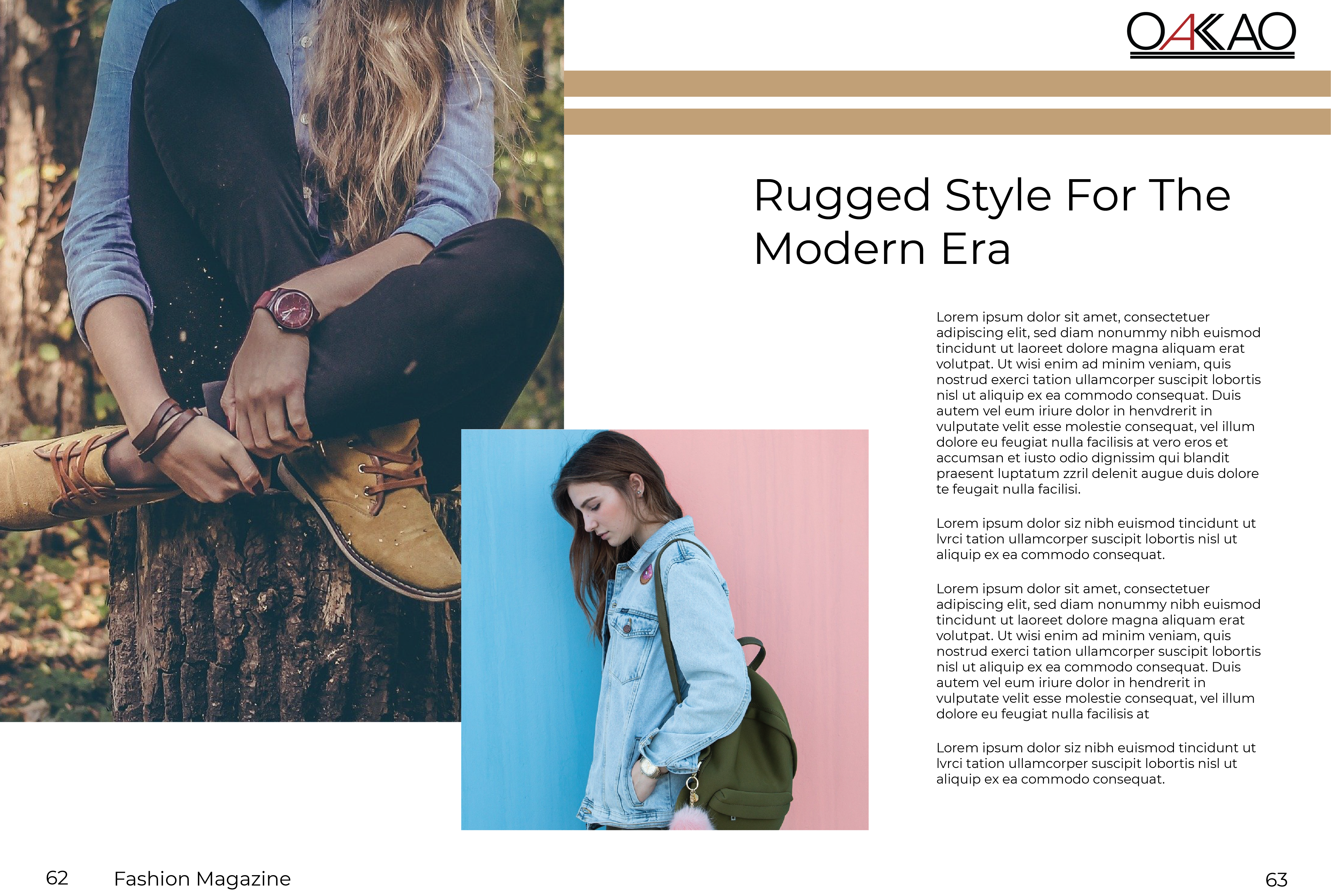
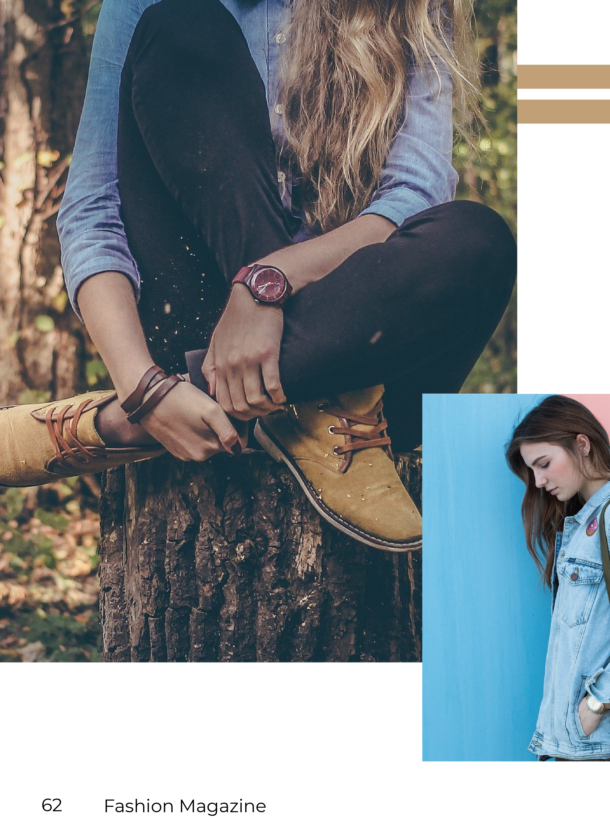
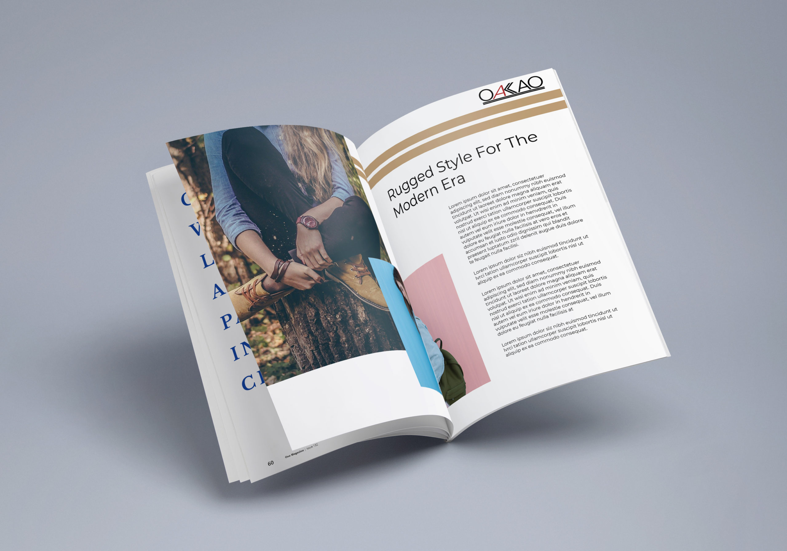
For this project I created a magazine layout for a fashion magazine the featured Oakao. I left a lot of white space on the page and limited the number of pictures in order to convey the openess of the outdoors and peaceful sense of nature. My pictures were selected in order to show the clothing in nature but also their use as everyday street clothes. This keeps the sense branding but also broadens the demographic of those that might look into purchasing the cloths; rugged, outdoors may be the inspiration for the style but these clothes are modern and for a more urban demographic as well. I also utilized the two consecutive lines motif that can be seen in the word mark on a larger scale in the magazine layout in order to build a better sense to the brand as a whole and tie into the word marks design.
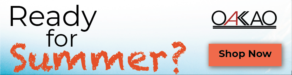
Oakao: Mock-up and Online Ad Campaign Gallery


See More
Take a look at my next portfolio project or check out the gallery for some more pictures of my work on this project. If you would like to get in touch please contact me.